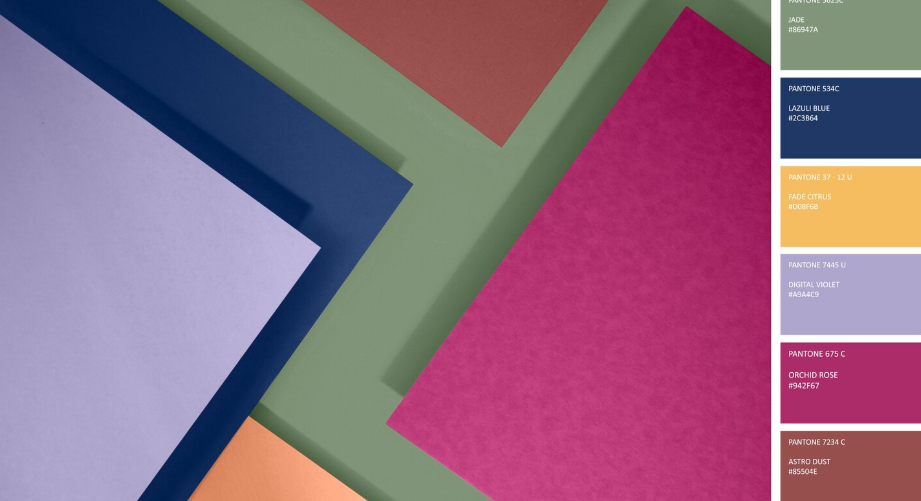
When your brand hires a production partner like BVS Film Productions, it’s more than simply pressing record. The visuals you deliver need cohesion, emotion, and identity baked into every frame. One often overlooked but incredibly powerful lever is the palette of colours you choose — your theme palette.
Why does colour matter so much?
At its core, when people watch video they’re absorbing story, mood and brand all at once. Colour isn’t just decoration — it acts like a silent narrator, guiding feelings and setting tone. Studies show that colours influence audience emotional responses: lighter, more saturated colours tend to correlate with positive emotion, while darker, muted tones can signal melancholy or tension. (featuredcontent.psychonomic.org) In the world of film and brand video, that means the palette isn’t optional — it’s strategic.
1. Start with brand values, then map to emotion
For a brand film, the first step isn’t “which colour looks nice?” but “what should viewers feel?” and “what brand identity must come through?” If BVS is filming for a premium client who wants trust, reliability and sophistication, a palette of deep blues, muted golds and clean whites might serve better than neon brights.
Why? Because in marketing colour psychology shows that blue often conveys competence and trustworthiness. (Wikipedia) You’re building more than visuals — you’re aligning mood, brand story and audience perception.
2. Build your theme palette with intention
Once you have the emotional map, you pick your palette. But don’t scatter colours; this is about mapping. Good brand-film palettes follow what filmmakers call schemes — monochromatic, analogous, complementary — each with its own mood potential. (StudioBinder)
A monochromatic scheme (e.g., shades of one hue) gives calm, cohesion.
An analogous scheme (neighbouring hues) feels harmonious and natural.
A complementary scheme (opposite hues) can create vibrancy and tension.
For BVS’s brand clients, you might choose one dominant colour aligned with the brand, a secondary that connects emotionally (the “mood” colour) and an accent to highlight calls-to-action or key moments. This is your “colour map”. Stick to it across lighting, costumes, set design, graphics and post-grading.
3. Use colour transitions to tell the story
Your theme palette isn’t static. In a brand film, the visual journey often mirrors the narrative arc: challenge → solution → transformation. Colour shifts can reflect that. For example:
Start with cooler, more muted tones while setting context or problem.
Move into warmer, richer tones as the brand solution emerges.
Finish with a strong brand colour or bold accent as the takeaway.
Filmmakers frequently use this technique to “map” a change in mood. For a brand video shot by BVS that intends to uplift or inspire, the palette shift becomes a subconscious cue: “we’ve arrived”.
4. Keep it consistent, but flexible
Once the palette is chosen, consistency matters. All visuals — whether aerial shot, interview close-up or motion graphics — should feel like part of the same visual world. That’s what makes the film feel like “brand film”, not just a collection of nice shots.
But: flexibility is still key. You may need to adjust for lighting, environment, skins tones, location colours. The theme palette provides the guardrails, not a straitjacket. In post-production, colour grading becomes the final step where you push everything into that unified world.
5. Why this matters for high-risk/risk-complex sectors
Since BVS does brand films where clients may be tackling complex industries, niche audiences or unconventional marketing angles, the choice of theme palette becomes even more critical. In sectors where you are educating or shifting perception (rather than just selling a lifestyle), colour and mood become purpose-built.
For example: If you’re doing a film for a manufacturing brand that wants to appear cutting-edge but trustworthy, using neon tech-colours might confuse. Instead, pairing a steel-blue main with a vivid accent and grounded neutrals signals both innovation and stability. The visual credibility becomes part of persuasion.
6. Your next steps (for your next BVS production)
Workshop with the client: What mood do we want? What 3 words sum up the brand story?
Pick your dominant, secondary and accent colours (with HEX codes).
Create a mood-board or look-book showing how those colours show up in environment, props, text overlays.
Shoot with palette in mind: wardrobe, lighting, set dressings, and camera filters should reference those colours.
In post-production, apply colour grading that confirms the palette and maintains consistency throughout.
Review the finished film: ask if the viewer would describe the mood as you intended (without seeing the palette list). If yes — you’ve succeeded.
Final thought
In brand filmmaking the story you tell isn’t just verbal or scripted — it’s visual from the moment the camera rolls. Colour & mood mapping via a thoughtful theme palette isn’t an afterthought; it’s foundational. For a partner like BVS Film Productions, when you impress with both emotional clarity and brand alignment, you’re doing more than filming — you’re elevating the narrative.
Let’s Bring Your Vision to Light
Are you ready to ensure your video content is up to the mark? With top industry professionals at BVS film productions, we’re here to help you create content that reaches your target audience, improves brand image, and boosts your brand’s reputation.
👉 Contact us today to step up your video content!
📧 Email: info@bvsfilmproductions.com
📞 Phone: 440-653-9911
🌐 Visit: https://www.bvsfilmproductions.com/
Let’s make your content stand out and impactful!

