In the world of video production, visuals speak louder than words—and color is one of the most powerful voices. At BVS Film Productions, we’ve seen how the right color choices can elevate a story, connect with an audience, and turn a simple message into something unforgettable.
Color isn’t just a matter of aesthetics. It’s a tool rooted in psychology and emotion. Used strategically, it has the power to influence how viewers feel, behave, and remember what they see on screen.
Why Color Affects Emotion
Colors evoke emotional responses, often before the viewer even understands why. It’s subconscious. Red can signal urgency or passion, while blue builds trust and calm. Yellow brings energy and optimism, while dark shades like black or deep green can create sophistication or mystery.
Scientific research supports this. A study published by Nature Humanities and Social Sciences showed that color grading in video directly impacts areas of the brain related to empathy and memory. This means that your audience isn’t just watching—they’re feeling something. And that feeling is driven, in large part, by the colors on screen.
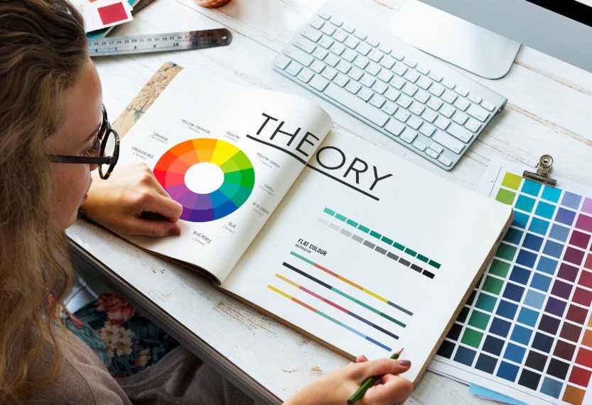
Designing with Purpose: Applying Color Theory
At BVS, we don’t pick colors because they “look good.” We design color palettes based on the message a brand wants to convey. Every project begins with understanding the emotional arc of the story. What do you want your audience to feel at the start, in the middle, and by the end?
If we’re producing a brand video for a financial service, cooler tones like navy or steel gray help establish trust and professionalism. For a wellness company, soft greens and whites suggest calm and balance. And for a bold, high-energy sports brand? Reds, blacks, and vibrant contrast grab attention and push adrenaline.
This approach comes from the fundamentals of color theory. Concepts like complementary and analogous color relationships help guide the emotion of each frame. But we’re not married to rules. We use them to inform decisions that feel emotionally true for each client and story.
Beyond the Frame: Cultural Context of Color
One size doesn’t fit all when it comes to color. Cultural meaning plays a huge role in how people interpret visuals. In Western cultures, white is often associated with purity and simplicity. In many Eastern cultures, it’s linked to mourning. Red might symbolize danger in the U.S. but celebration and fortune in China.
That’s why cultural awareness is essential. For brands reaching international or diverse audiences, our team ensures every color choice is appropriate, respectful, and resonant. We never assume a color means the same thing to every viewer. We research, test, and design with intention.
The Role of Color Grading in Post-Production
Even with careful planning, raw footage rarely looks the way it’s meant to feel. That’s where color grading comes in.
Using tools like DaVinci Resolve and Adobe Premiere Pro, our editors adjust saturation, contrast, exposure, and tone to craft the exact visual mood the story calls for. A golden hue can make a memory feel nostalgic. A cool, bluish tint can underscore isolation or seriousness. These choices are subtle, but they make all the difference.
Color grading is not just technical—it’s emotional finishing work. It’s how the final video earns its atmosphere and its impact.
Famous Examples of Color in Film
Some of the most memorable moments in film history rely entirely on color to evoke meaning. Think about the green tint in The Matrix, which visually cues viewers into the artificial world. Or the haunting red coat in Schindler’s List, the only splash of color in an otherwise black-and-white film, representing innocence amidst horror.
Even animated films like Inside Out and Coco use color deliberately to represent emotional states or entire realms. These examples aren’t about making things pretty—they’re about making stories unforgettable.
What It Means for Your Brand
For businesses and brands, color plays a strategic role in building identity. A consistent palette strengthens recognition and communicates values instantly. Whether it’s your logo, your website, or your video campaign, colors should be telling the same story.
At BVS Film Productions, we work closely with each client to identify what emotions they want to convey. Then we reverse-engineer those emotions into visual choices—from wardrobe and set design to lighting and post-production grading. The result is a video that not only looks beautiful but feels aligned with your mission and message.
Let’s Create Something That Sticks
If you’re investing in video, you’re investing in communication. And color is a language worth speaking fluently.
Let’s Bring Your Vision to Light
Are you ready to ensure your video content is up to the mark? With top industry professionals at BVS film productions, we’re here to help you create content that reaches your target audience, improves brand image, and boosts your brand’s reputation.
👉 Contact us today to step up your video content!
📧 Email: info@bvsfilmproductions.com
📞 Phone: 440-653-9911
🌐 Visit: https://www.bvsfilmproductions.com/
Let’s make your content stand out and impactful!